Start with the shape#
Each graph lets you follow one condition through time. Look for where it rises, falls or stays steady, then select a time to read the details beneath it.
- At a saved point, the location stays fixed and the graph follows the forecast.
- Along a passage, the graph follows the boat through its calculated route. A change can reflect both the weather changing and the boat reaching a different place.
- Comparing departures, columns share an elapsed-time scale: the same horizontal position means the same time since departure, not the same clock time. A shorter passage ends earlier in its column.
- Comparing models at a point, columns share the same forecast time range. Check each model’s Run and Until labels for its issue time and coverage.
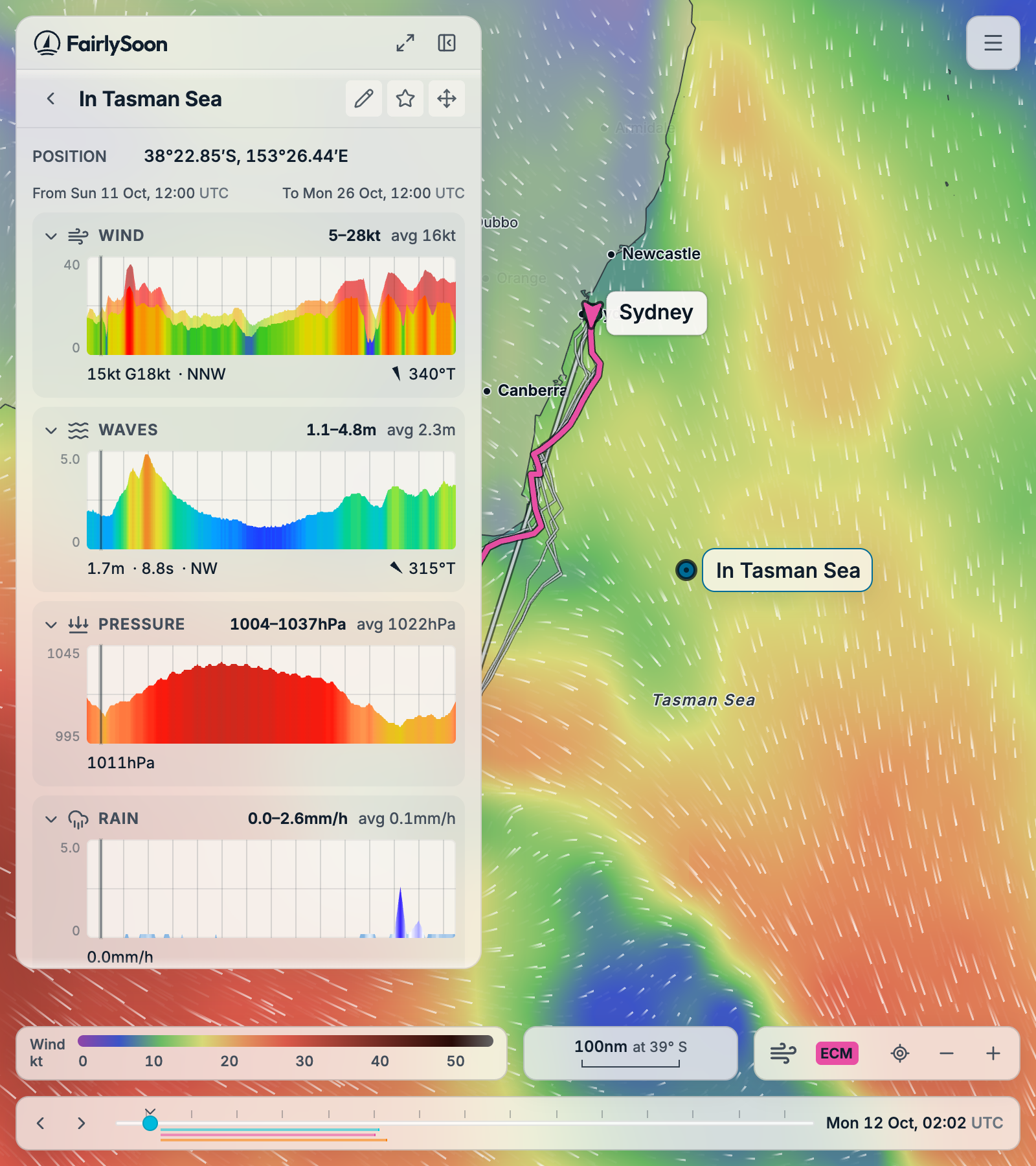
Select a graph heading to expand or collapse it. Click or drag across an open graph—or drag with a finger—to change the selected time. The vertical cursor marks that time; passage graphs also have a small boat marker. The readings below the graphs follow your selection. Thin vertical grid lines mark midnight in your device’s timezone, not sunrise or sunset.
Read the heading and the line underneath#
The heading summarises the whole displayed profile. For example, 5–28kt avg 16kt means a minimum of 5 knots, a maximum of 28 knots and a time-weighted average of 16 knots across the available samples. It is not a confidence interval. The small numbers on the vertical axis show the graph’s scale; compare those before comparing the height of unrelated graphs.
The line underneath describes the selected time. These examples use the default units; your unit preferences can change speeds, heights, temperatures, pressure and rainfall units.
| Example reading | What it means |
|---|---|
| 15kt G18kt · NNW | Wind of 15 knots, gusts of 18 knots, coming from north-northwest. G means gusts. |
| 1.7m · 8.9s · NW | Wave height of 1.7 metres, wave period of 8.9 seconds, coming from the northwest. |
| 045° beside a red or green pointer | Wind or waves relative to the boat’s course. Red is port; green is starboard. |
| 340°T | A true compass direction: clockwise from true north, with east at 90°, south at 180° and west at 270°. |
| +0.5kt · Helping | Current contributes half a knot in the direction of the route. |
| 6.2kt · Sailing · NE, with 045°T course | Calculated boat speed, propulsion mode and course towards the northeast. |
| 68% · Waves | Local comfort score; waves are the largest contributor to discomfort there. |
For wind and waves, the compass direction says where they come from. For the boat’s course and the current’s flow, it says where they go to. The relative wind/wave angle is 0° straight ahead, 90° abeam and 180° astern. It is relative to the route’s course and does not adjust for boat speed, so it is not an apparent-wind reading. Point forecasts have no boat course and omit that relative angle. Hover or focus the direction readings for a reminder.
Above passage graphs, % motoring describes the share of time using the motor, while % extra under Distance compares the route length with direct legs through its waypoints. A partial route note means the calculation does not reach the finish; its graphs describe only the part calculated.
What the colours mean#
Weather graphs use the selected Standard or Marine weather palette. They follow the map’s value-to-colour scale, with stronger colours for the smaller graph. Colour represents the value, not whether it meets your comfort settings. For example, a red pressure graph means high pressure on its scale; it does not mean the same thing as red on a wind graph.

These keys show the full colour ranges in default units. A graph can show a narrower vertical range, and values beyond a colour range keep its end colour. Use the numerical reading for the exact value. Speed, Comfort and passage Current have their own colour meanings, explained below.
Some graphs provide context without affecting the calculation. For example, wind and currents affect movement, wave conditions affect comfort, and pressure and temperatures are for inspection. See the routing and comfort input breakdown.
Model colours are a separate key: GFS is cyan, ECMWF is pink and AIFS is orange. In the departure comparison, Shading identifies the model supplying the filled graphs and Lines identifies the other models drawn over them. Those line colours identify models, not the strength of the weather.
Speed#
This passage-only graph shows the boat’s calculated progress along the route. Blue means sailing, amber means motoring and grey means the propulsion mode is unavailable. Colour changes describe how the boat is moving; the height of the graph gives its speed.
The reading underneath adds Sailing or Motoring, plus the course. The passage summary’s % motoring is the share of passage time spent motoring. Boat performance and the motor setting affect these estimates; see Boat and comfort settings.
Comfort#
This passage-only graph shows comfort at each point, from 0 to 100: higher is more comfortable under your settings. A dip helps you find the less comfortable part of the passage. The overall result’s comfort score summarises the passage; it is not the value at the cursor.
The fill identifies the largest contributor to discomfort at that point:
| Colour | Label beneath the graph |
|---|---|
| Green | Comfortable (97% or above, or no dominant discomfort factor). |
| Orange | Strong wind. |
| Yellow/gold | Gusts. |
| Blue | Sailing upwind. |
| Teal | Waves. |
| Violet | Rain. |
| Pink | Convective instability, from CAPE. |
| Red | Lightning risk. |
Several factors can contribute at once; the colour names only the largest. Select the time and read the label rather than relying on similar colours. Hover or focus that label for its explanation. Read Reading your results for how comfort is used in rankings.
Wind#
The main filled area is forecast wind speed. The lighter band above it reaches up to the gust speed where gust data is available. The heading’s range and average describe wind speed, not the gust maximum; the G reading beneath the graph gives gusts at the selected time.
In Standard, the wind scale moves from purple/blue through green and yellow to orange, red and darker colours as wind increases. Marine uses the alternative scale shown above. Below the graph, read the compass direction and, on a passage, the red/green relative-angle pointer.
Waves#
The graph’s height and colour represent forecast wave height. The seconds reading beneath it is the wave period, the interval between waves; it has no separate coloured band. The direction and relative-angle pointer show where the waves come from and how they meet the boat’s course.
Use height, period and angle together when comparing passages. The selected wave forecast supplies these values; gaps mean coverage is unavailable there.
Current#
This passage graph shows the part of the current acting along the boat’s course, not the current’s total speed. Blue/teal above zero helps progress; orange below zero slows it. A value near zero can still mean a current flowing across the route.
The reading underneath says Helping, Slowing or Mostly across, and shows the true direction of flow. For current speed and direction at a fixed location, use the map’s Current layer and point readout.
Pressure#
This is forecast pressure, normally in hPa. The fill uses a fixed pressure colour scale; read the rise or fall through time and the selected numerical value. Its vertical axis can begin above zero so smaller changes remain visible. There is no extra directional reading below this graph.
Rain#
Rain is a rate, normally in mm/h, rather than the accumulated rain for the passage. Peaks show periods of heavier forecast rainfall. The colour scale is unevenly spaced to distinguish light rain as well as heavier bursts; read the selected value for the amount. A valid zero means no forecast rain at that sample; an empty graph or missing reading means something different.
CAPE#
CAPE is convective available potential energy, shown in J/kg. It is an indicator of atmospheric instability used by the comfort model’s Convective instability factor. Higher values mean more available energy. It is not a percentage chance of a thunderstorm or lightning. The graph uses the CAPE colour scale, and the line beneath gives its value at the selected time.
Lightning#
This passage-only graph shows the Met Office probability of any lightning in a three-hour window, labelled % in 3h. It is a forecast probability, not a count of strikes or a live lightning detector. The graph changes in steps to preserve those forecast windows.
Colour progresses from blue-grey through orange to dark red as probability increases. The lightning forecast has its own coverage even when you select another routing model. An incomplete-coverage note means some of the passage has no lightning forecast; those stretches are omitted from its lightning comfort penalty, rather than treated as a measured zero probability.
Air temperature and sea temperature#
These graphs show temperature, normally in °C. Their colours represent temperature rather than comfort; the vertical axis may cover only the range encountered in this forecast. The reading below gives the selected temperature.
Sea temp · ECMWF, for example, identifies the sea-temperature source. That source may differ from the selected atmospheric model. In the full point comparison, each column already identifies its source, so the shared heading simply says Sea temp.
Empty graphs and coverage notes#
A spinner or Sampling… message means values are still loading. After that, a dash in the heading, a blank selected-time reading or a gap means the value is unavailable. It does not mean zero. A comparison graph may also end because that passage has arrived or that forecast has reached the end of its coverage.
Notes such as No gust or CAPE fields, Wave forecast unavailable or Current data is unavailable along this route explain missing inputs. Different models need not provide the same fields or forecast length. Check these notes before interpreting a quiet-looking graph; see Troubleshooting if expected data stays missing.
The boat polar diagram#
Open Settings → Planning and select Polar diagram beside the performance field (the radius icon on narrow screens). The popover describes boat performance, not weather through time. Angle around the diagram is true wind angle; distance from its centre is boat speed. The coloured and differently dashed curves represent true wind speeds. Hover or tap a curve to read boat speed, true wind speed and angle; arrow keys explore the samples when focused. Close the popover with its × button, Escape or a click outside it. See Boat and comfort settings for the diagram and performance adjustment, or Importing a boat polar to add your own boat.