Inspect the weather map#
Open Weather to choose a forecast layer and source. The source pill identifies the data currently displayed. Some layers use their own source even when another atmospheric model is selected; for example, currents and lightning probabilities have separate providers.
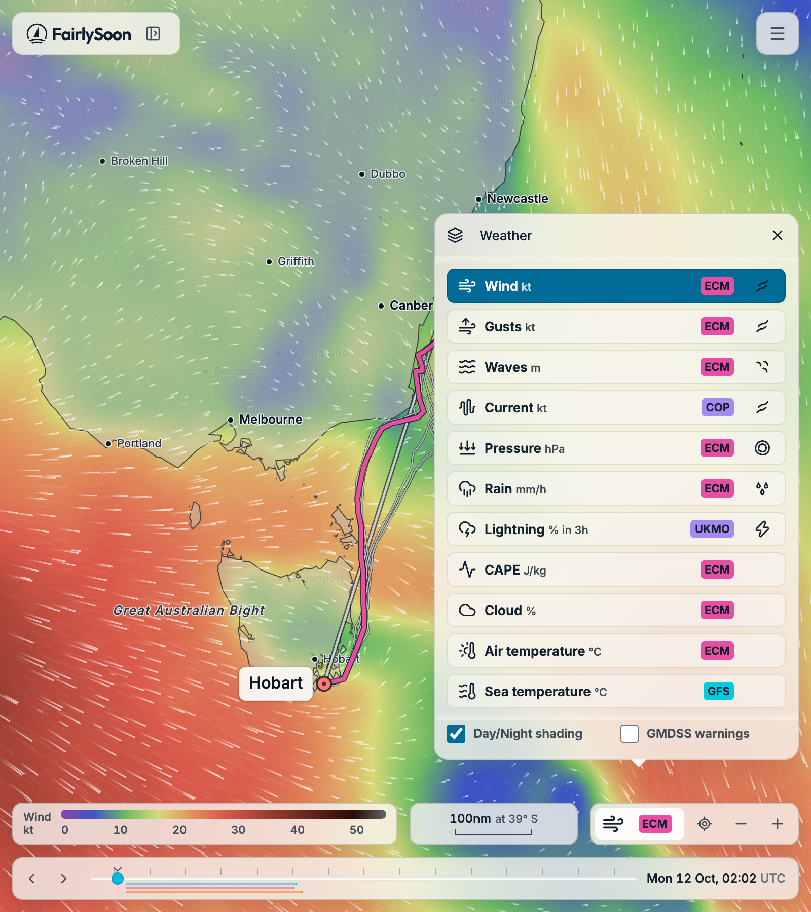
Move the timeline to change the valid time: the time the forecast describes. Use the previous, next and Now controls for smaller changes.
The legend describes the selected layer’s units and colours. Directional glyphs show additional information such as wind or current direction. Missing areas and freshness warnings require attention: an empty area is not a zero value or an all-clear.
For Standard or Marine weather colours, open the three-line menu and choose Settings → Appearance → Weather theme. Dark/Light mode is in the same tab; measurement choices are in Units. See Settings and appearance for the visual choices and unit controls.
Displaying a layer does not mean it influences the calculation. Wind and currents affect movement; waves, gustiness, rain, CAPE and lightning also inform comfort. Pressure, cloud cover and temperatures are for inspection. See which forecasts affect routing and comfort for examples and the distinction between Speed and Comfort routes.
Inspect a point#
Select a location on the map to inspect its forecast. A temporary inspection does not create a saved point until you choose to save it. Saved points can be reused as route endpoints or waypoints.
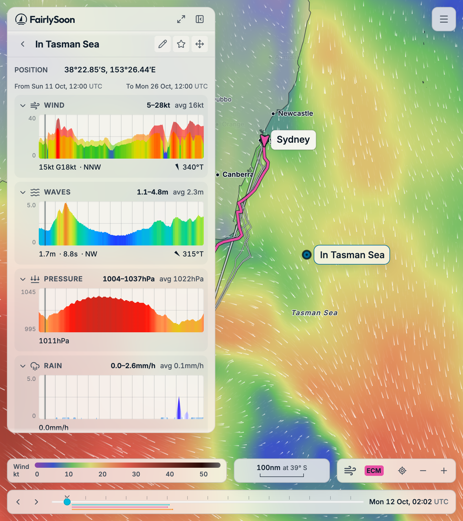
Choose Add point in the map readout to save that location and open its forecast in the sidebar. You can also open an existing point from your saved points. The sidebar shows the conditions at the selected time, with charts for how the forecast changes at that location. Move along a chart or use the map timeline to inspect another time.
Understanding the graphs explains the colour scales, ranges and the wind, wave and direction readings beneath each graph.
Compare the forecasts at a point#
Select Compare all models, the expand button at the top of the sidebar, to open the full view. Each column is a forecast model for the same location; the weather charts share axes so you can compare their timing and strength. The Run label above each column shows when that model forecast was initialized; Until shows how far it extends. These labels appear in the point comparison view. Route results do not currently show a forecast run timestamp.
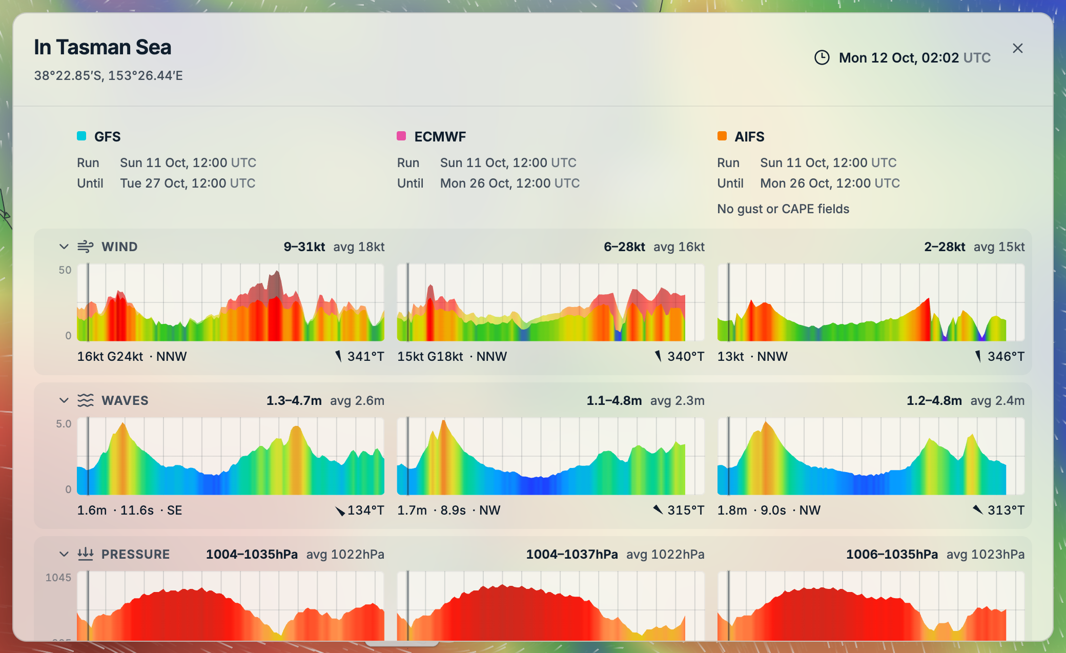
For example, look for whether the models put stronger winds at the same time, or whether one expects rougher seas. Close the full view to return to the same point in the sidebar.
Point markers#
A centre dot marks a saved point. Ordinary saved points are pale, turning blue when selected. Route starts are green, finishes coral and waypoints pale; they keep these colours when selected. Starred points remain gold; see Saved data for how stars lock positions. All selected points have a heavier outline. A temporary inspection is a lavender ring without a dot; the device-location marker is cyan without a dot.
Location and place search#
The location control can centre the map using your device’s location, subject to browser permission. An approximate IP-based area may be used if device location is unavailable. You can also pan the map, search by name or enter coordinates without granting location permission.
Search results and the displayed coastline are not navigational information. Verify route endpoints and approaches against appropriate nautical charts and local information.